I dropped this course.
Regards,
Raiza
Raiza Laroza
Friday, August 31, 2012
Monday, August 20, 2012
Week 5
Strategy statement:
The letter and number I am using is A8. As a strategy for
conveying this through my island, I plan to subtly and carefully placing
vegetation and water volumes to form shapes. This goes for both the micro and
macro scale within the island. For instance, I like the ideas of Lisa Rienermann
and the letters of the alphabet she captures from the particular cropping of
the sky and buildings. I want to take that idea of when you look up, you will
be able to see the letter and number. I want to also incorporate it into
roads/paths, so when you look below, it is somewhat visible.
Monday, August 13, 2012
Tuesday, August 7, 2012
Monday, August 6, 2012
Thursday, August 2, 2012
Monday, July 30, 2012
Week 2
Landscape into CryEngine no. 2
Alpes inspired terrain:
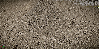
Texture:
This is a mix of my custom texture and a 3d rock texture from CryEngine. The tiling was made larger by going to Terrain Texture Layers > Material Editor.
Under 'Texture Map > Diffuse arrow > Tiling arrow. Make sure the boxes are ticked, and chage the Tile U & V into a smaller number to create larger tiles. This one was changed both to 0.1.
Subscribe to:
Posts (Atom)


